Global presets
Using global presets offers numerous advantages, making them an invaluable tool across various fields and applications. They ensure consistency, providing a uniform setup that enhances the user experience. Global presets also significantly boost efficiency, saving time and effort by allowing users to apply a comprehensive set of configurations with a single action rather than adjusting each parameter individually.
You can use our available presets or create your own presets
1. Color
- From the Color list page, click the Add new color button

- In the settings, you can customize the title and color

2. Hotspot
- From the Hotspot list page, click the Add new Hotspot button

- In the settings, you can customize the Title, General & Design


- General settings
+ Hotspot icon: choose an icon for the hotspot
+ Hotspot effect: choose a type effect
+ Config width, height, border-radius for the hotspot

- Design
Set color for hotspot background, hotspot border, hotspot icon color. You can Customize or use Global color you added

3. Tooltips
Product
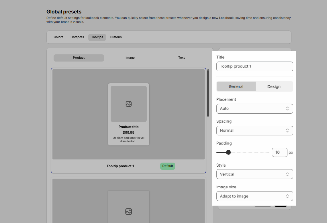
- From the Tooltips list page, click the Add new tooltip button

- In the settings, you can customize the Title, General & Design


- General settings
+ Placement: Select display position for tooltip
+ Spacing: Adjust the distance between the image and text
+ Padding: Adjust padding for item
+ Style: There are 2 styles (vertical & horizontal)
+ Image size: Change the size of the image

- Design
+ Gap: Distance between image and content
+ Width: Adjust tooltip width
+ Background color: Config Tooltip background color
+ Product title, product price, product description: Adjust color and font size

For the Image and Text, you can also perform similar actions as with the Product.
4. Buttons
- From the Buttons list page, click the Add new button button

- In the settings, you can customize the title and some other options


+ Alignment on tooltip: you can adjust the button to align left, center or right
+ Normal: customize the button to your liking
+ Hover: add effects to buttons for better user experience

After configuration, you can save and set default settings, duplicate or delete Preset

5. Products
- From the Products list page, click the Add new Product button

- In the settings, you can customize options

+ General options:
- Title: The Title defines display. Ensure that it is clear, concise
- Layout: Depending on the type of product and how you want it to appear in the store, you can choose between Horizontal or Vertical
- Alignment info: Adjust the alignment of product information (title, price, description,…) within the preset
- Gap: Adjust the distance between image and product info
- Gap product infors: gap between infors

+ Image options: These settings help control the visual aesthetics of product images
- You can adjust width & height for image
- Use border-radius to add rounded corners to your images, giving a softer and more modern look

+ Title & Price, Compare price options:
- Typography: customize typography for title
- Spacing: config padding & margin for title
- Color: config color Normal & Hover

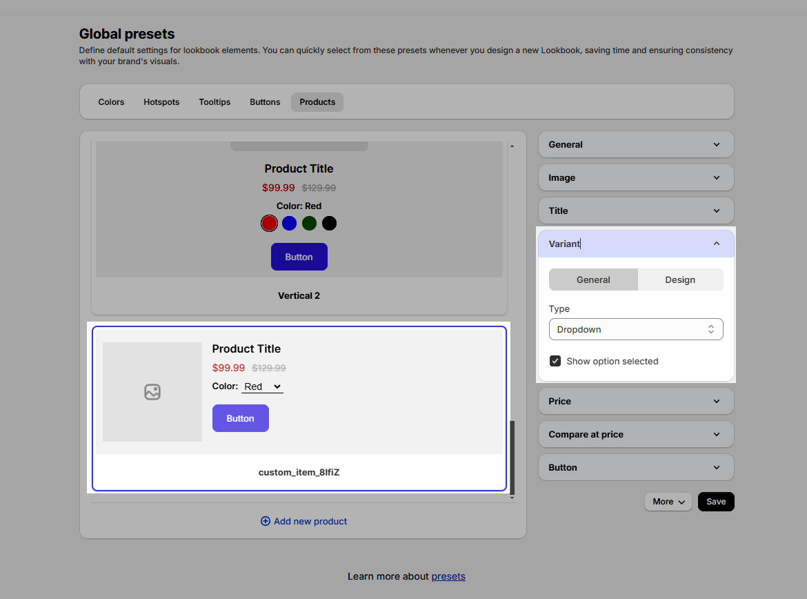
+ Variant options:
- General: config type and Show option selected

* Note: For Shopify color type, you need to create variant with metafield of categories that allows to create color

Create a new product => choose Category => Add variant (Connect metafield - Color)
Ex:

- Design: you can config color, typography selected for Label option selected. And width, height, color, background color, typography, border, spacing for variant dropdown

+ Button options: you can choose preset for button and adjust spacing

After configuration, you can save and set default setting, duplicate or delete preset


